As the natural world reawakens, it’s time to look around and see what shades are appearing in terms of spring colour trends, from pistachios and soft lilacs to blush pinks and cerulean blues.
The cyclical reemergence of pastel colours for spring represents more than seasonal convention but rather offers architects and designers a means to create residential interiors that respond to a collective desire for both tranquillity and vitality.
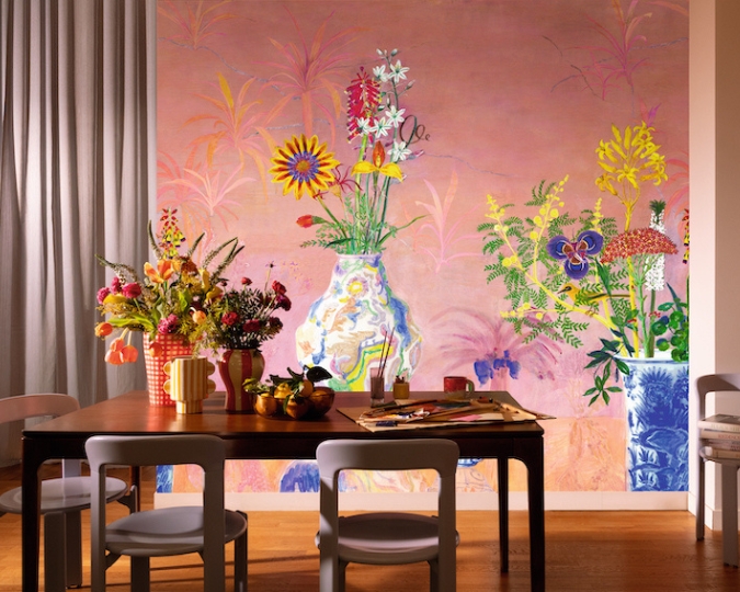
Bloom is a mural design which showcases larger-than-life floral arrangements in bold, expressive brushstrokes
Swiss textile house Fischbacher 1819 presents 'Bloom', a striking new wall mural design that captures the beauty and vitality of nature. Inspired by lush gardens bathed in the soft pink glow of sunrise, Bloom brings a sense of joy and optimism to interior spaces and is hand-painted using gouache paints.
Pistachio can be a playful yet cool shade as shown here by combining Restful Green 1litre Emulsion from £28 YesColours and Vision Futura 1300 Electric Inset Wall Fire £1,699 Direct Stoves
Pistachio green is the ideal shade to add a sophisticated touch to the interior, evoking nature while giving a contemporary feel. It works beautifully with warm neutrals, natural wood, as well as brass accents, creating a timeless yet modern effect.
The Ferdinand sofa by Arlo & Jacob is a modern take on a classic mid- century icon, softened by button-backed seat cushions and slim, sloping arms
Staying with pistachio green, it combines beautifully with pale yellow to create a harmonious interior colour scheme, sharing a natural connection, while maintaining subtle contrast. The soft, muted green of pistachio brings a calming, organic feel that grounds the space, while pale yellow introduces warmth and light that brightens without overwhelming. Together, these colours create a fresh, airy atmosphere reminiscent of spring gardens and natural landscapes.
Farringdon Purple Gloss Metro Wall Tiles available from Walls and Floors provide a shimmering finish in a captivating purple hue
Lilac is also a great choice for spring, as it captures the season's essence of renewal and freshness. This soft purple brings that sense of awakening and vitality indoors. Lilac strikes an ideal balance: more tonally interesting than neutral shades but not overwhelming, adding a gentle touch of colour that creates a soothing yet uplifting atmosphere.
The Midi, shown here in Chalk, Ocean & Navy £319, from Mustard Made lockers gives inspiration about how to deploy blue shades
Meanwhile, blue shades create a contemplative foundation that balances the season's natural vivacity, allowing architectural elements to breathe, while subtly referencing the expanding daylight hours.
In summary, these spring pastel shades are less a trend and more an essential part of the aesthetic vocabulary for architects and designers for articulating space, light, and the human experience.